Transforming the Image of Europe’s Capital
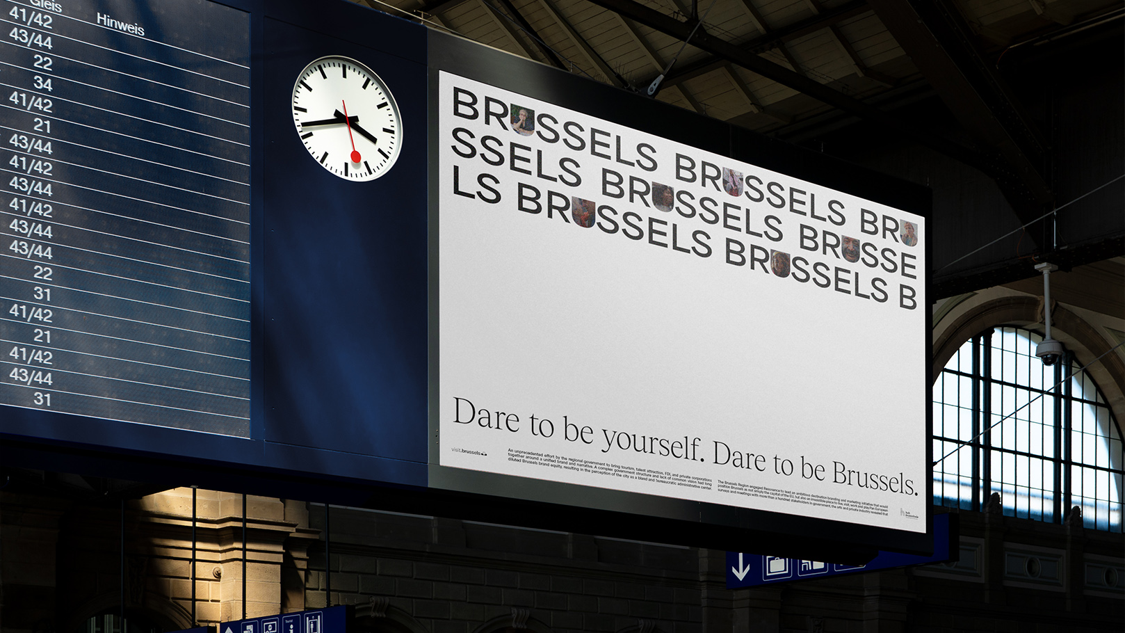
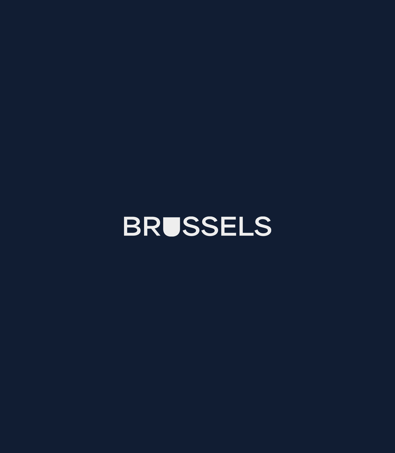


To reposition Brussels internationally, we chose truth over trope.
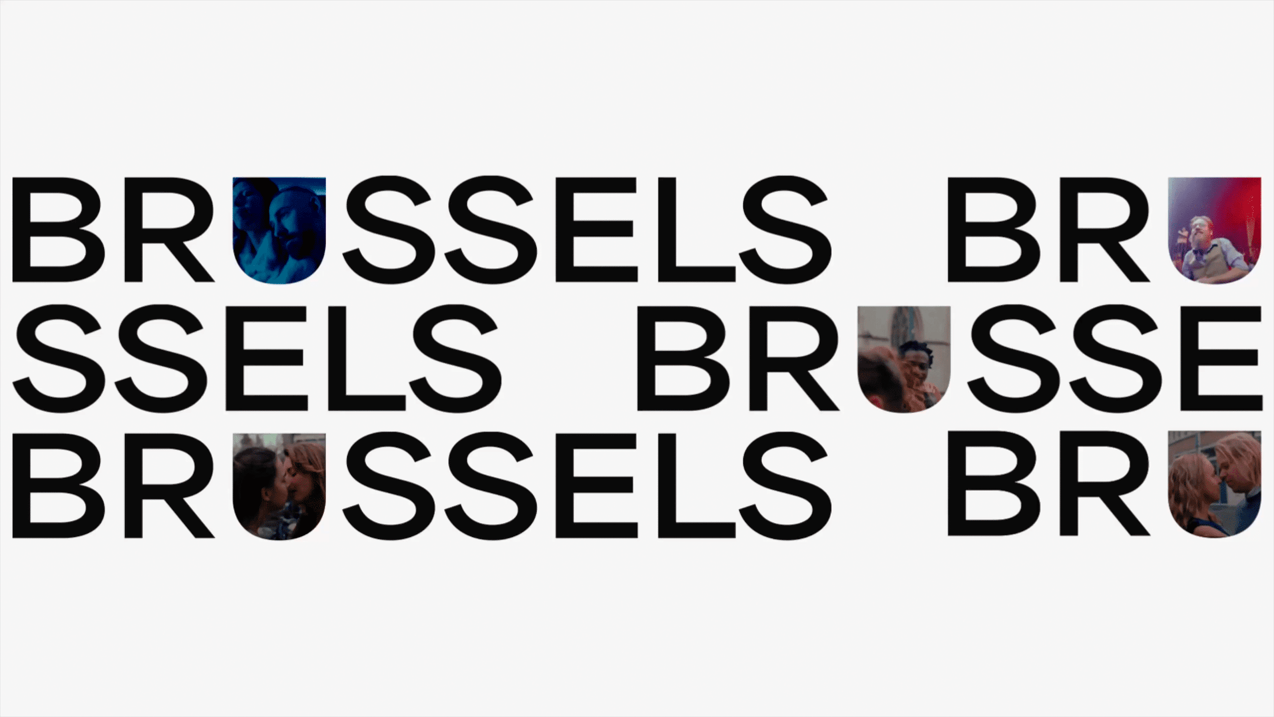
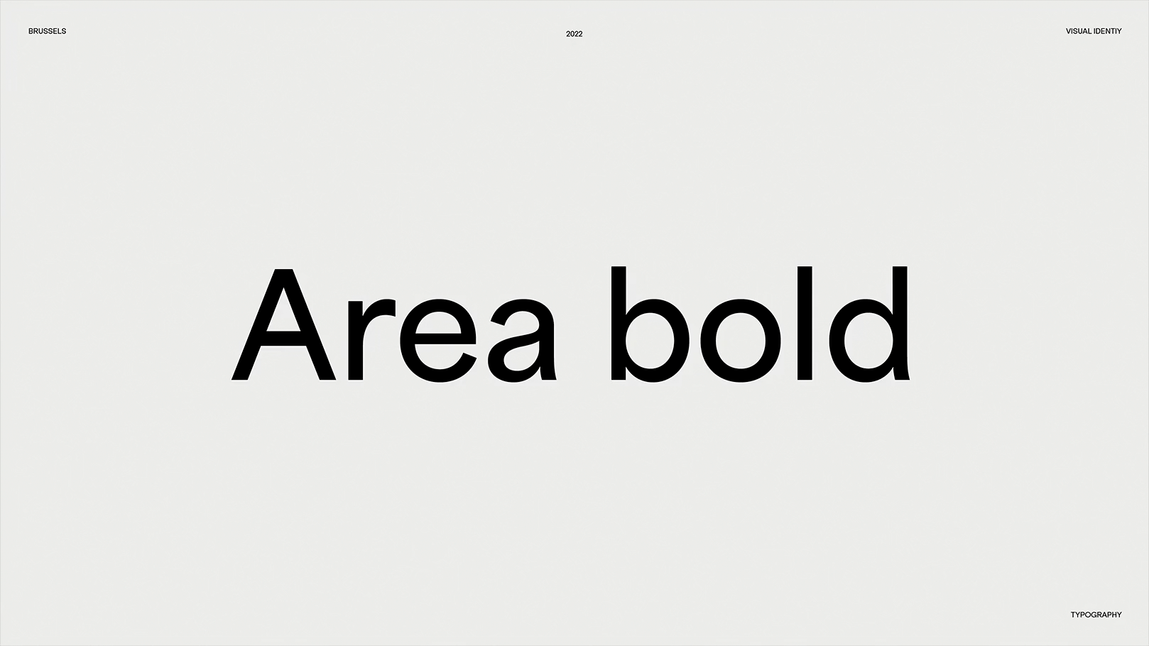
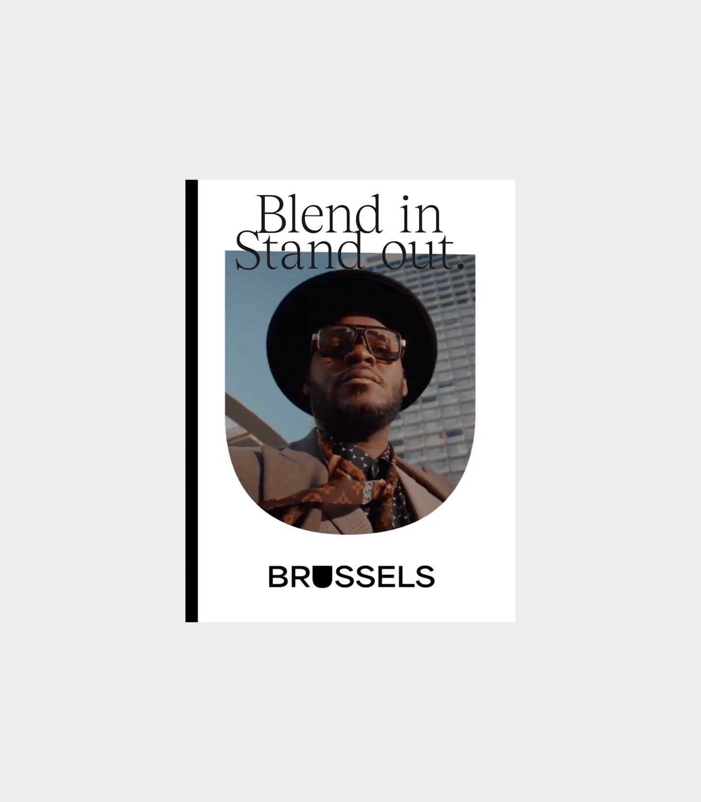
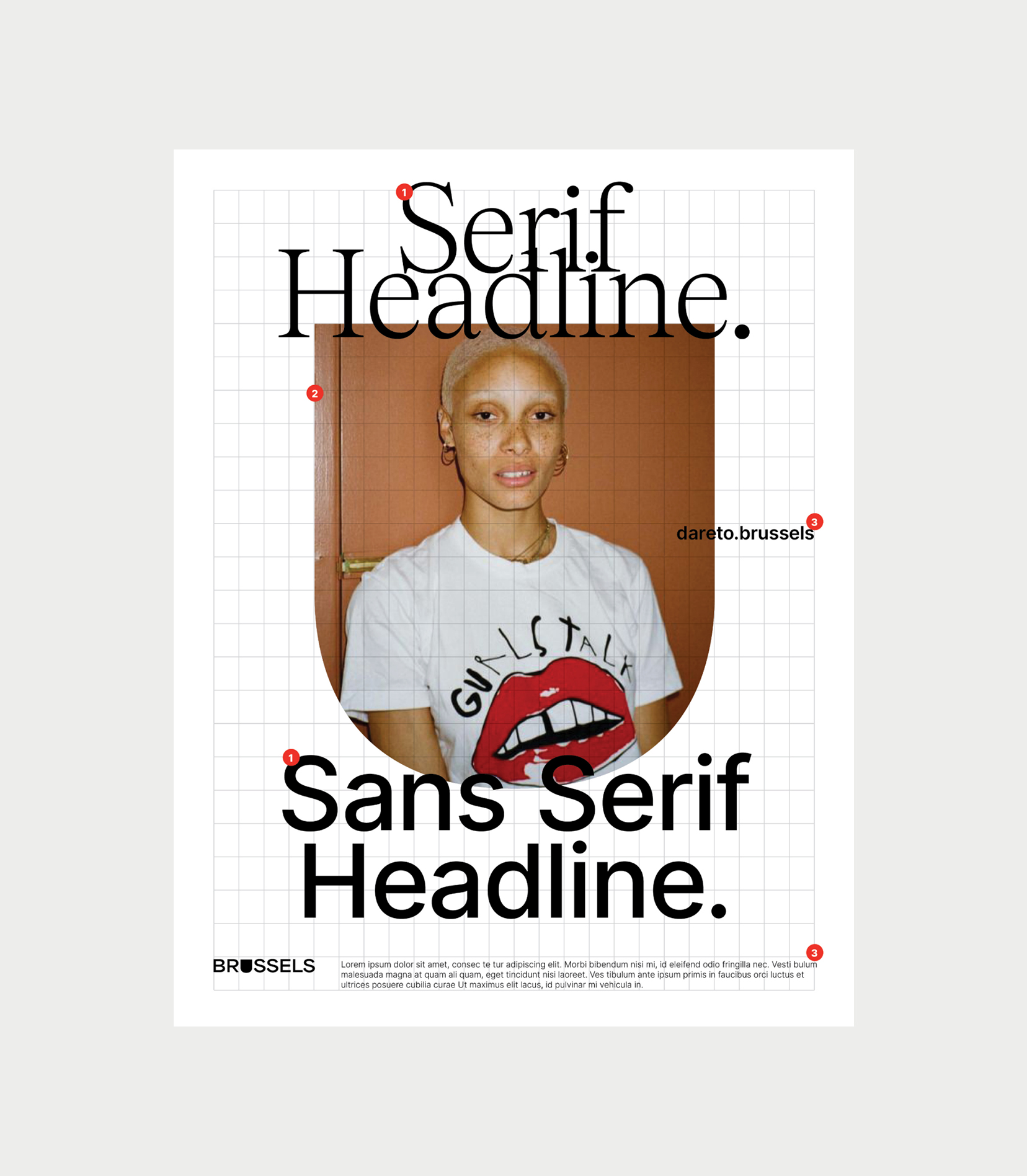
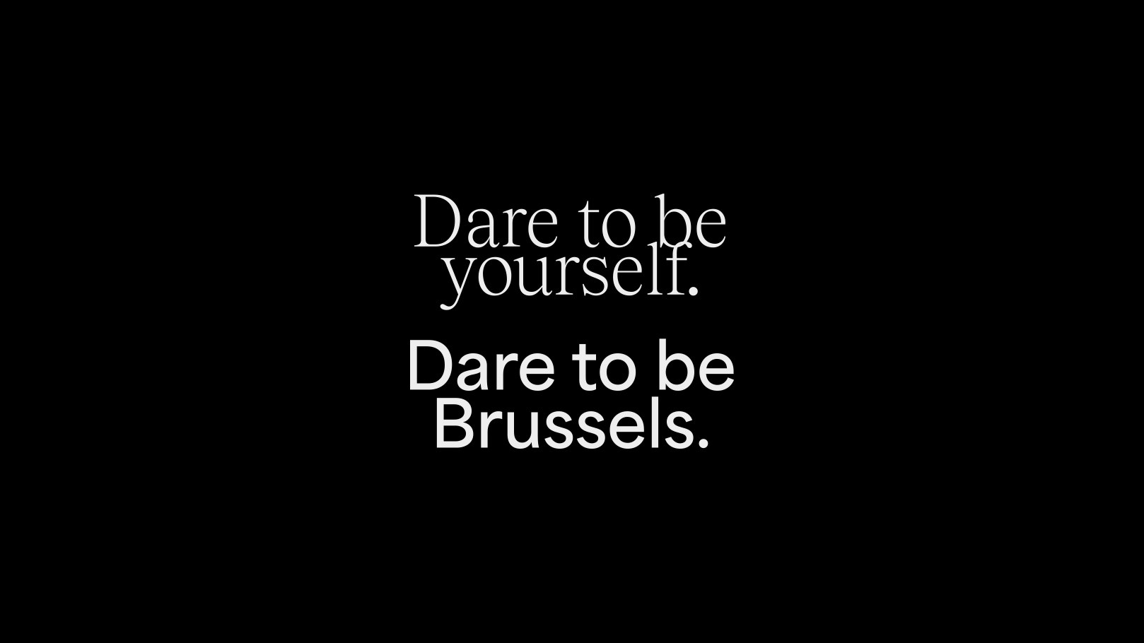
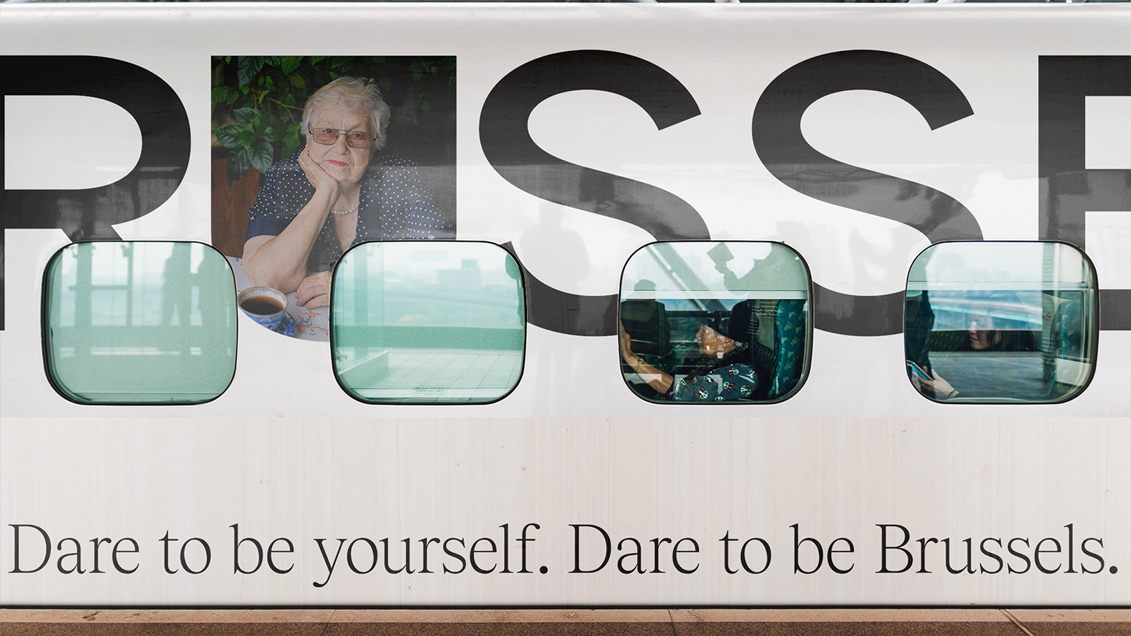
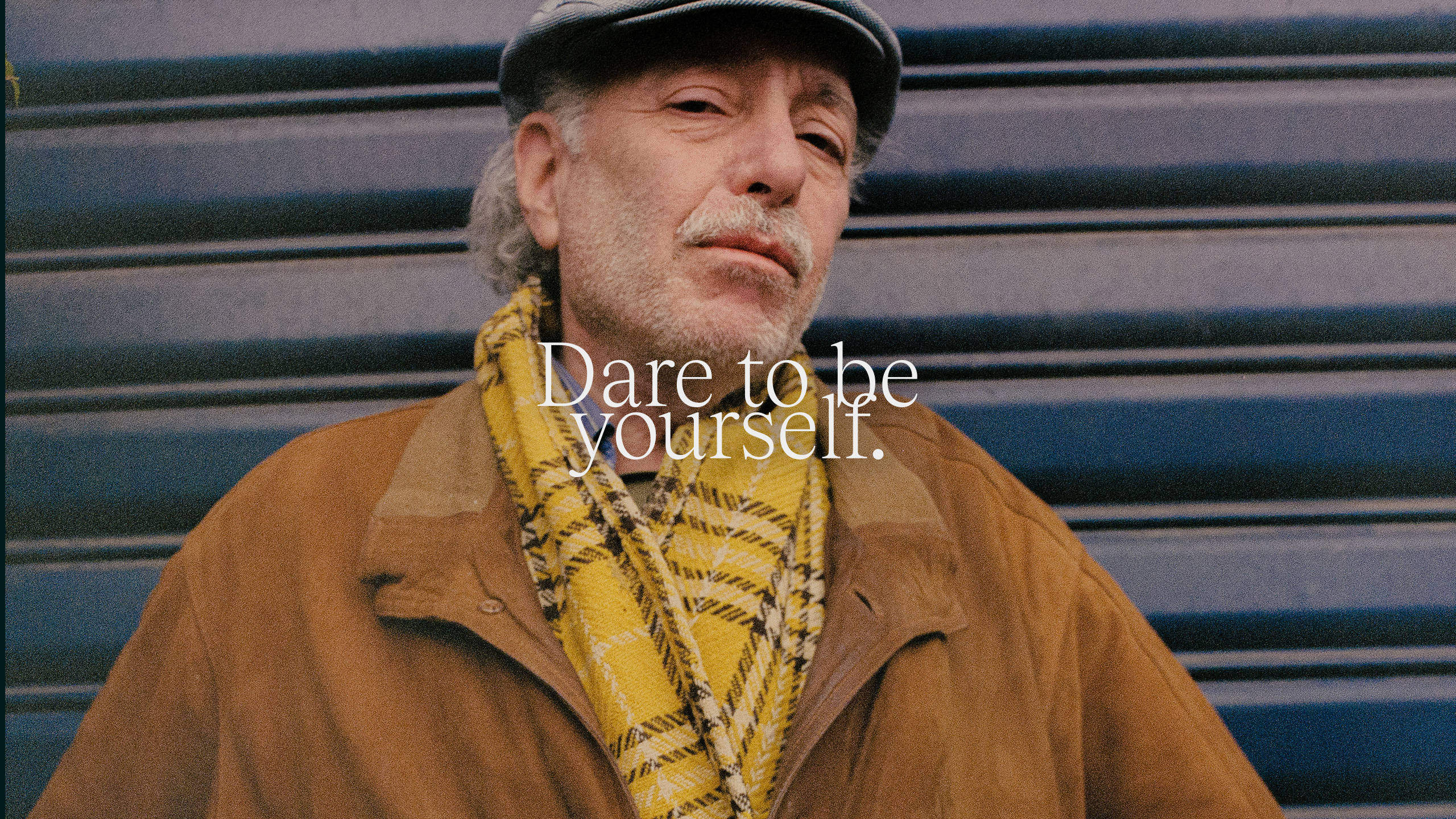
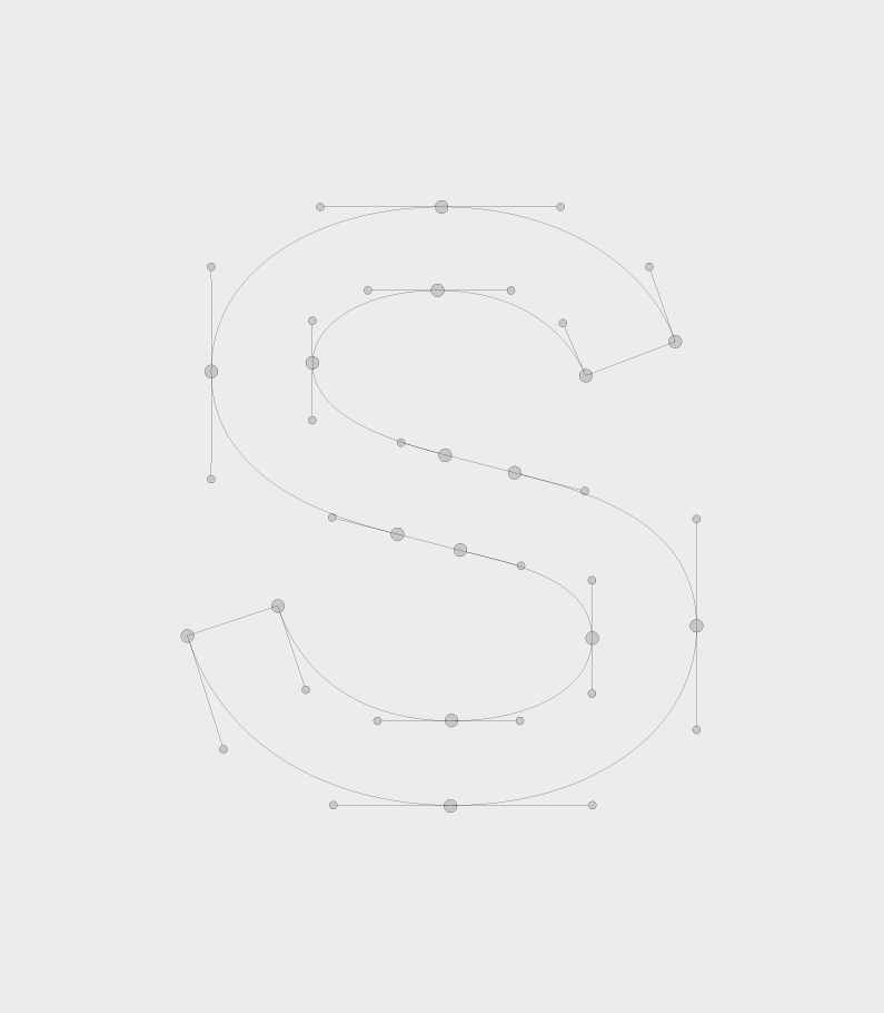
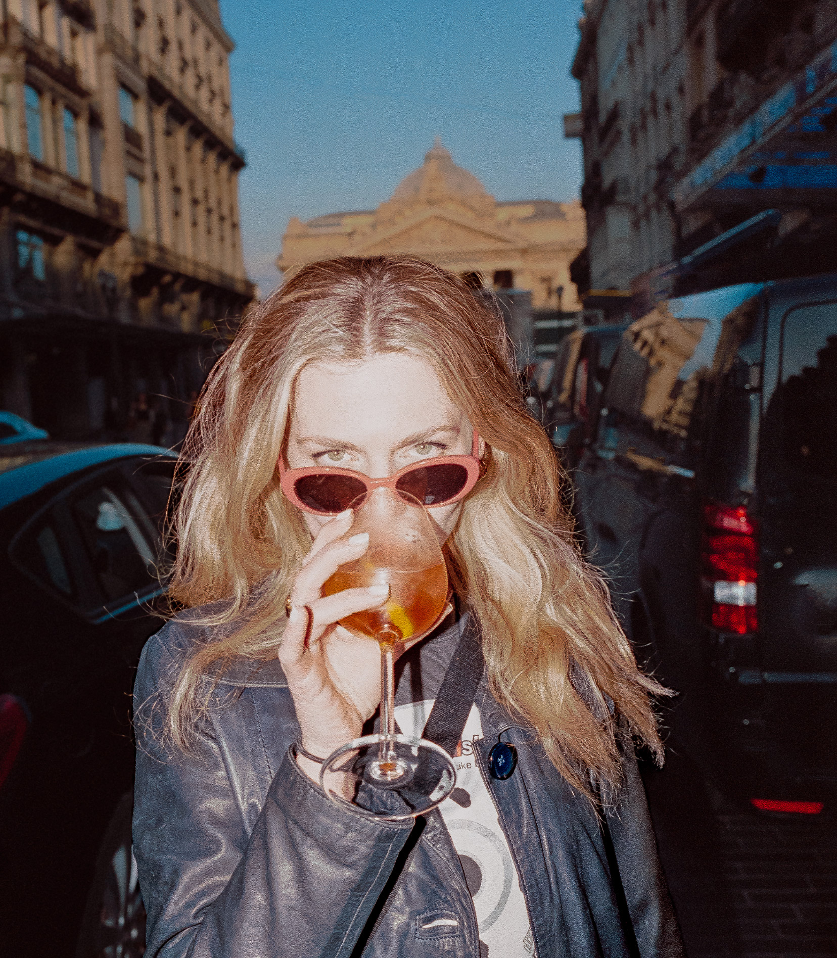
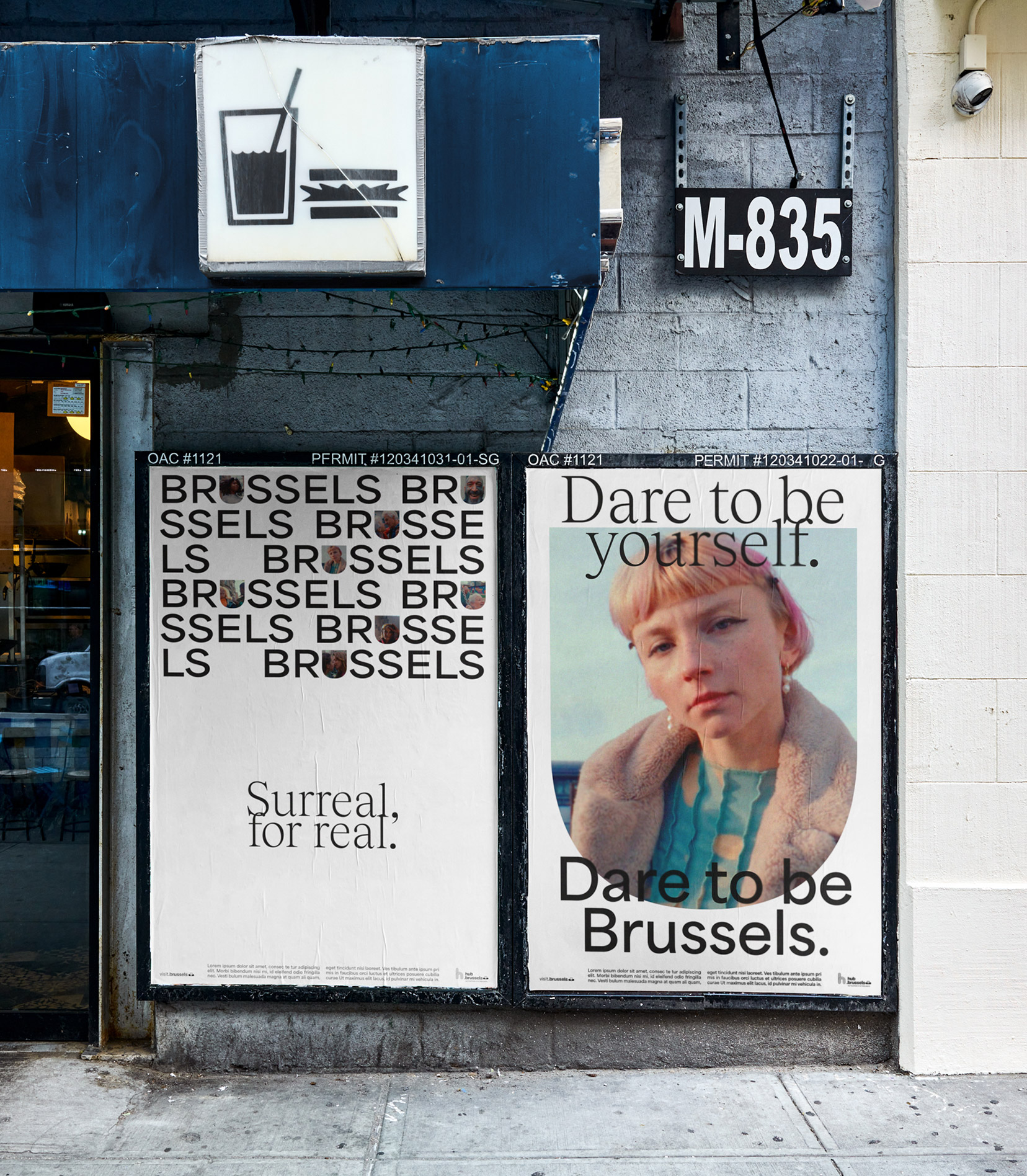
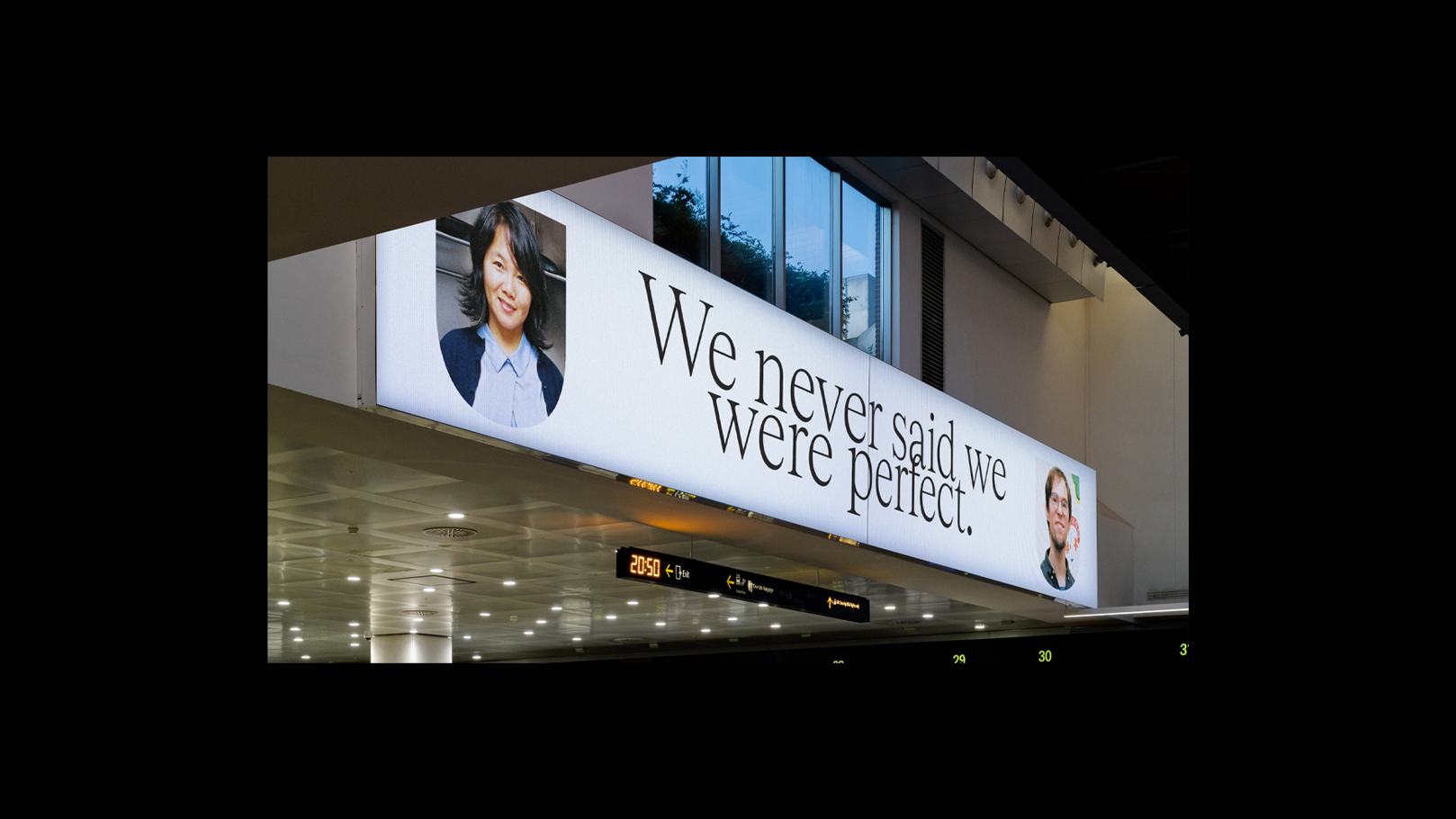
“Perfectly Imperfect” captures the city’s living aura: vibrant, layered, a touch unruly, and it anchors strategy, voice, and visual grammar. Plainspoken verbal guidelines, real-world shoots, and subtly irregular typography make the idea clear at a glance and strong in detail.
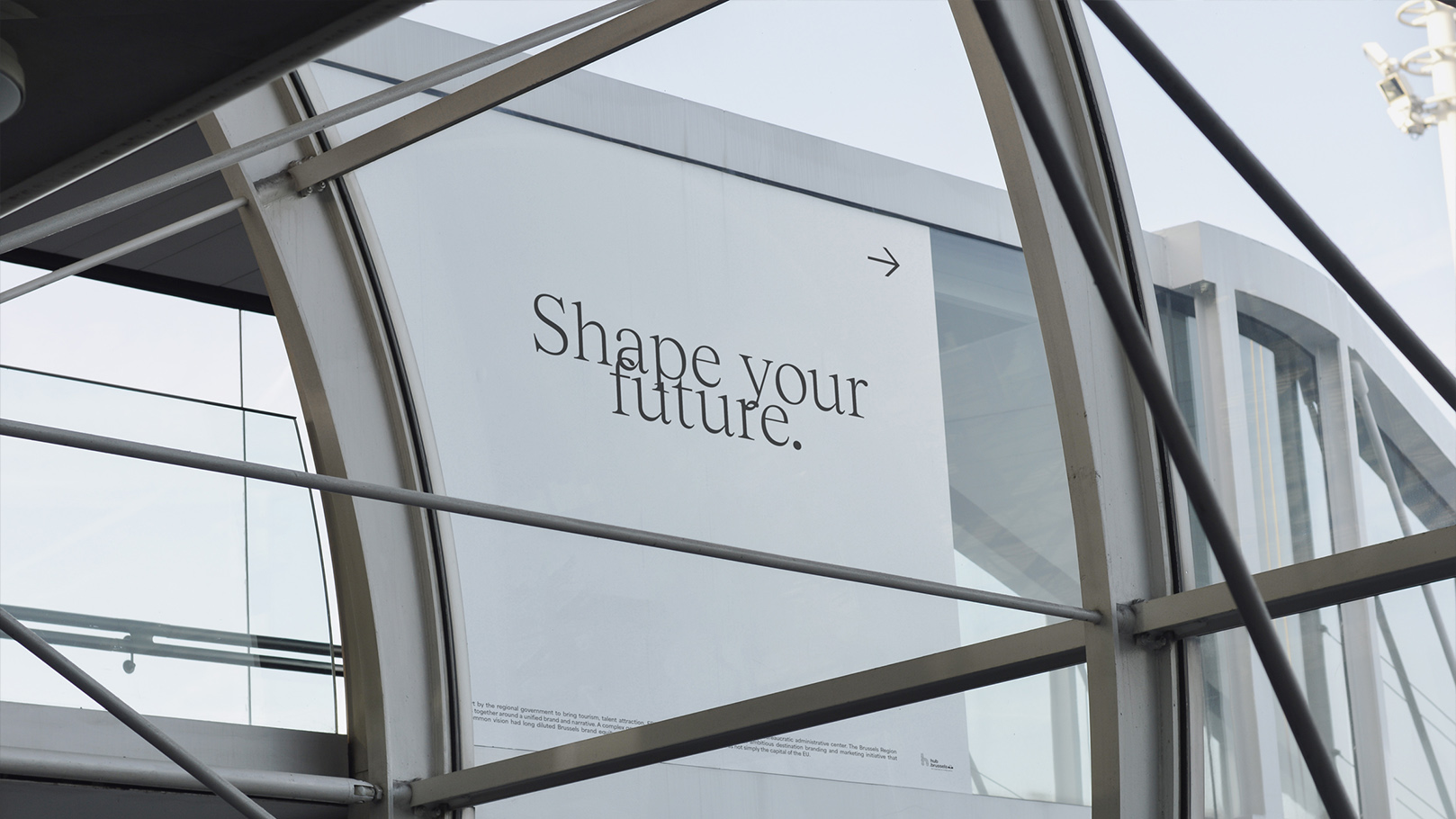
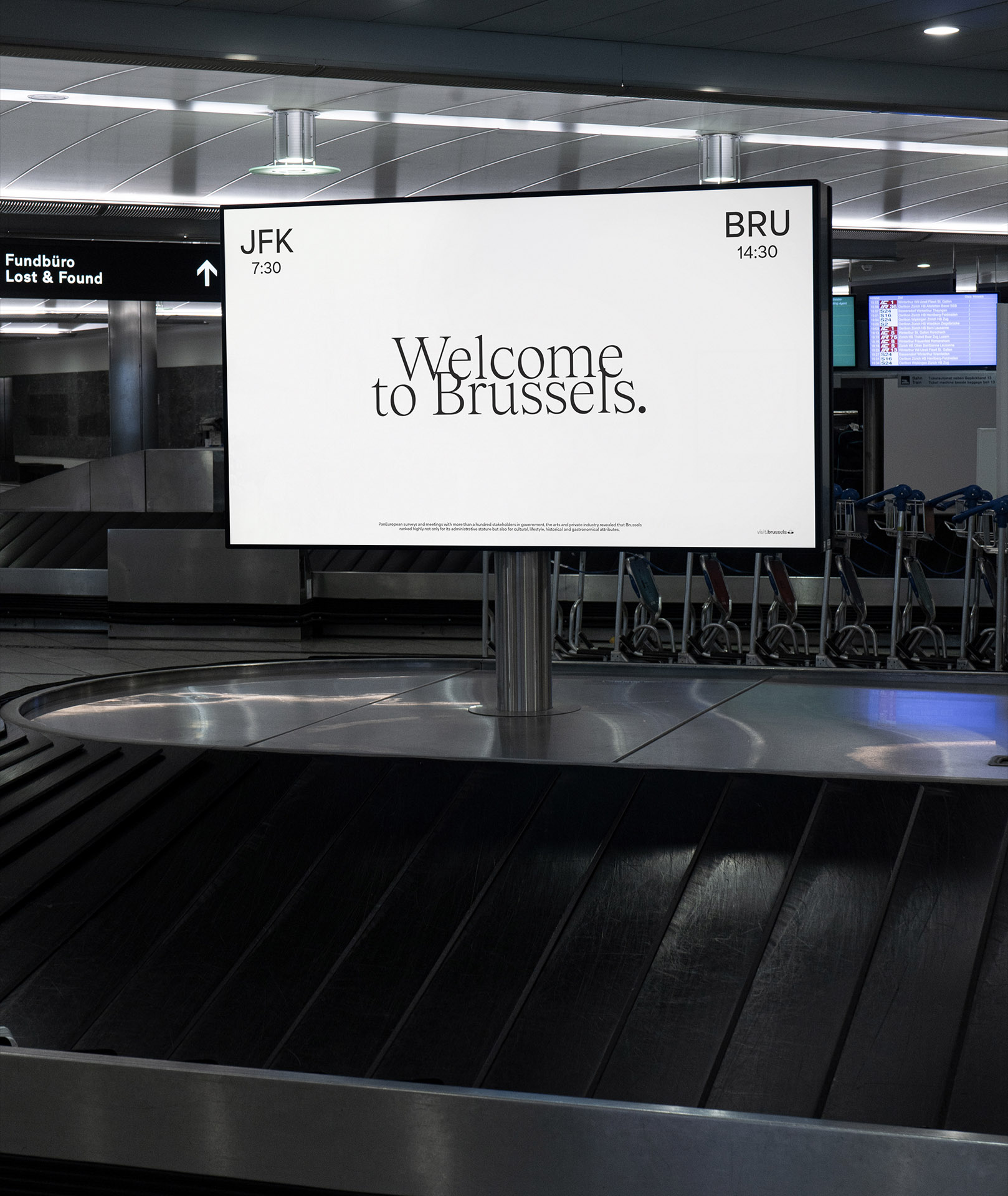
Built for handover.
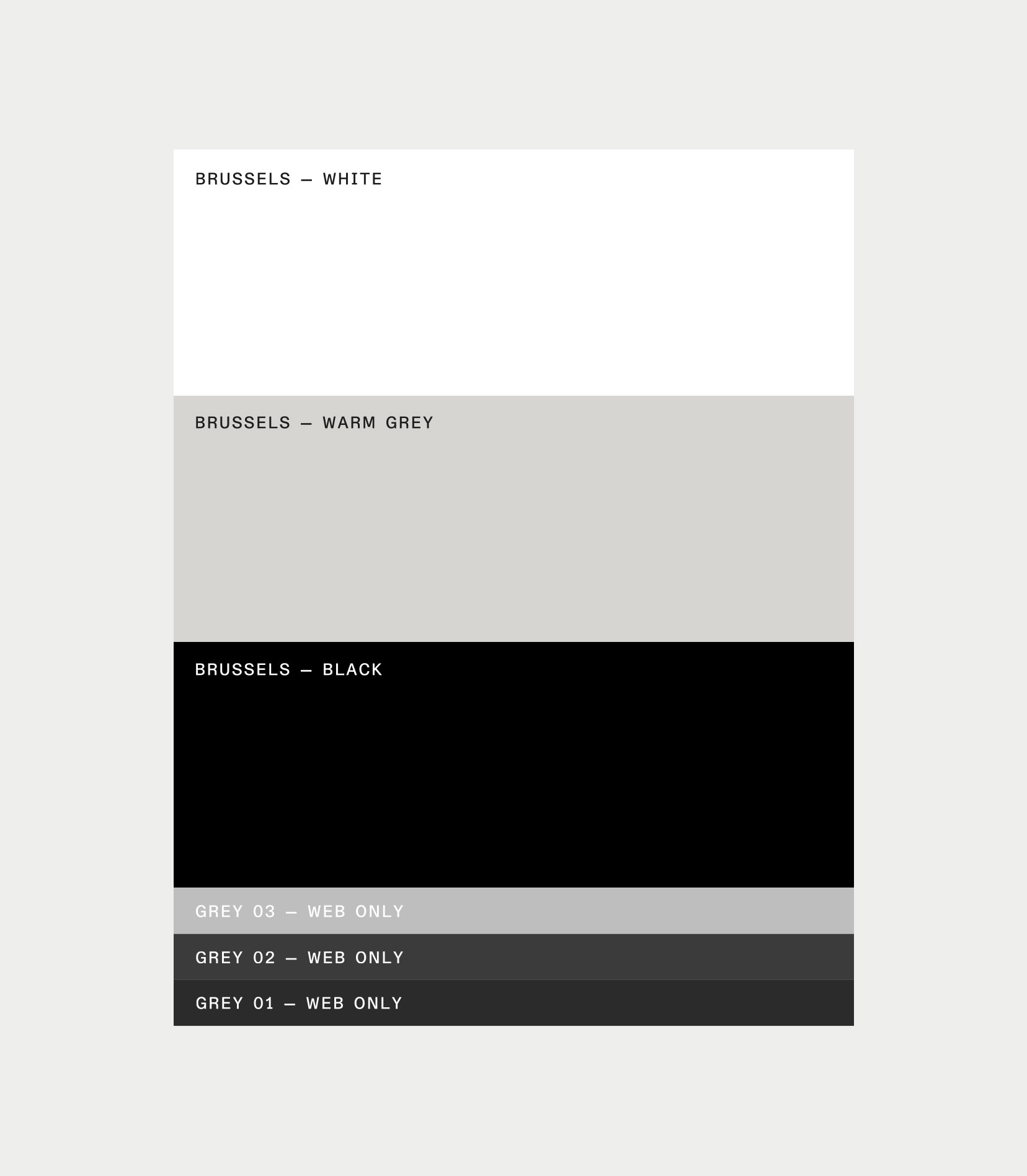
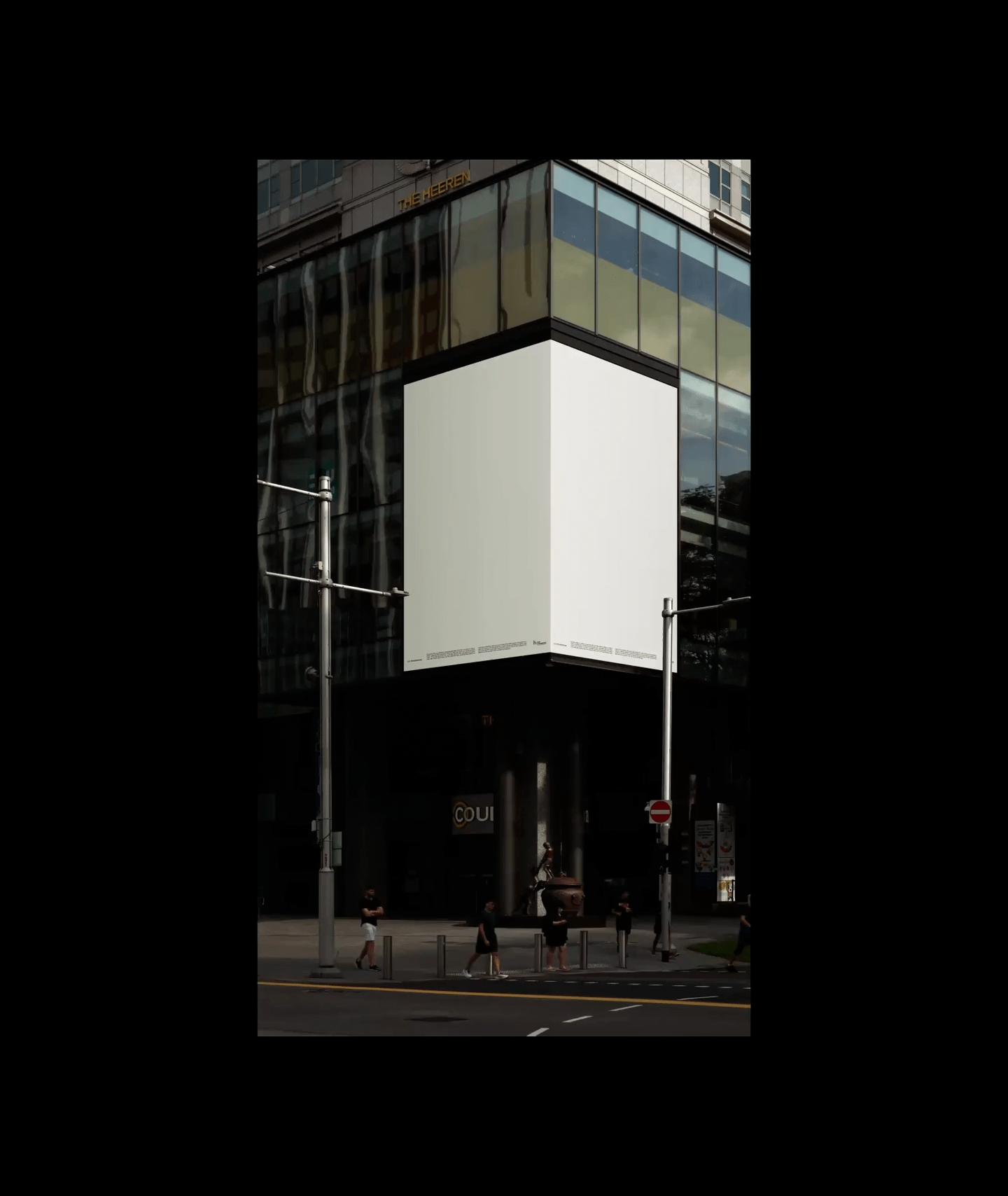
We built an agile design system and a clear graphic charter so any office in the world can pick it up fast.